Part 1: Target Market

The two images above were chosen at random as the basis for my target market and visual identity.
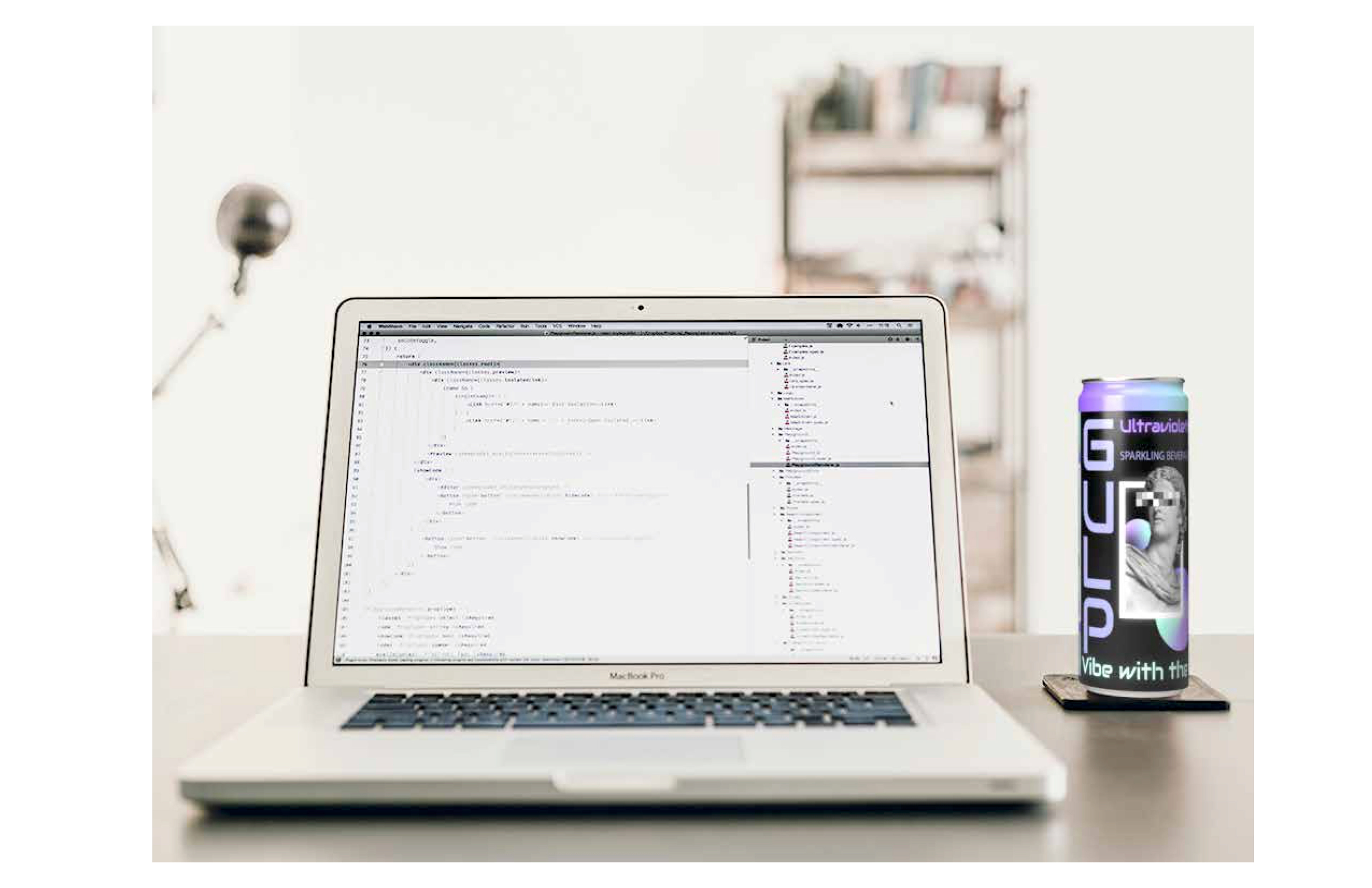
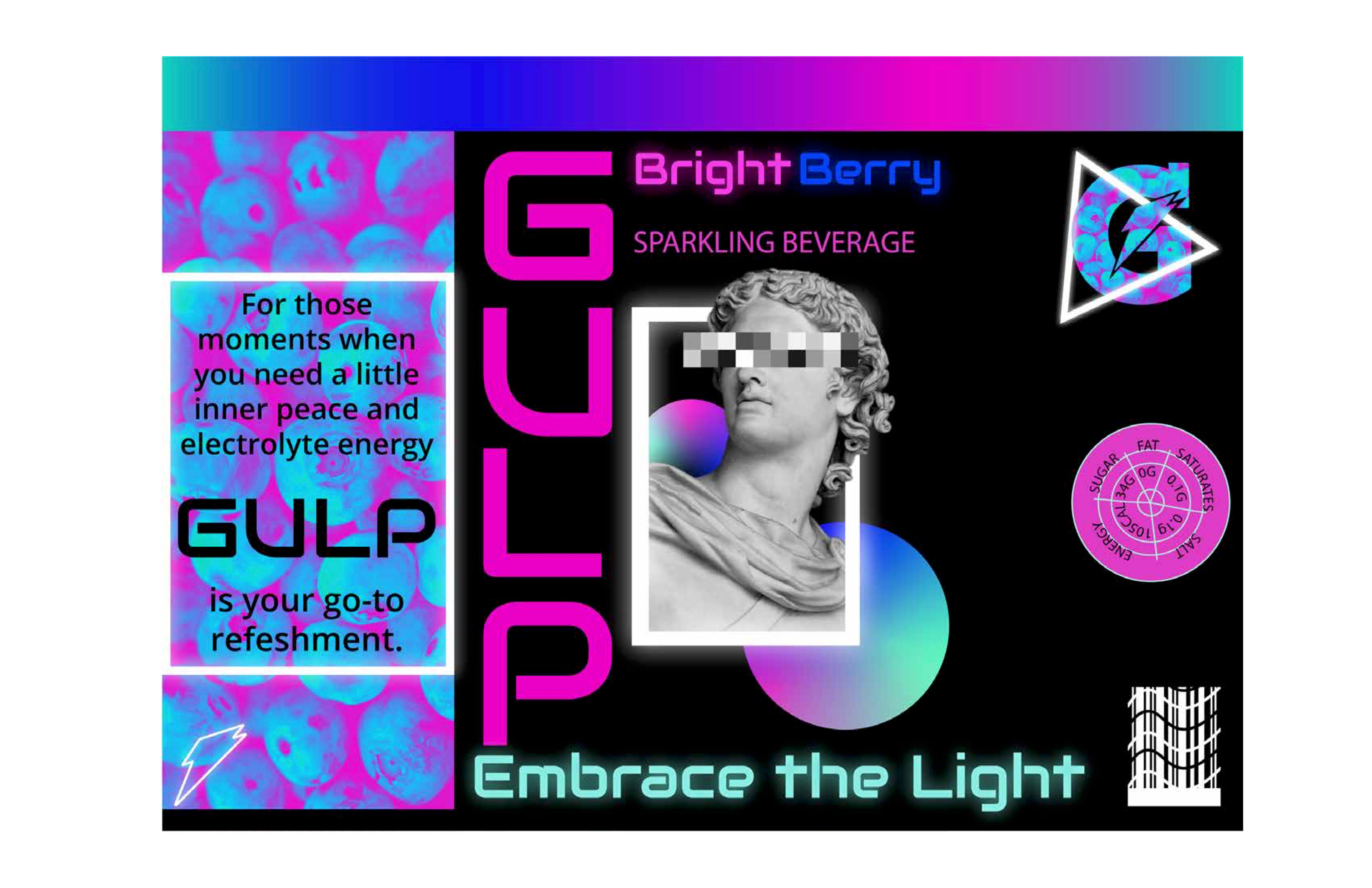
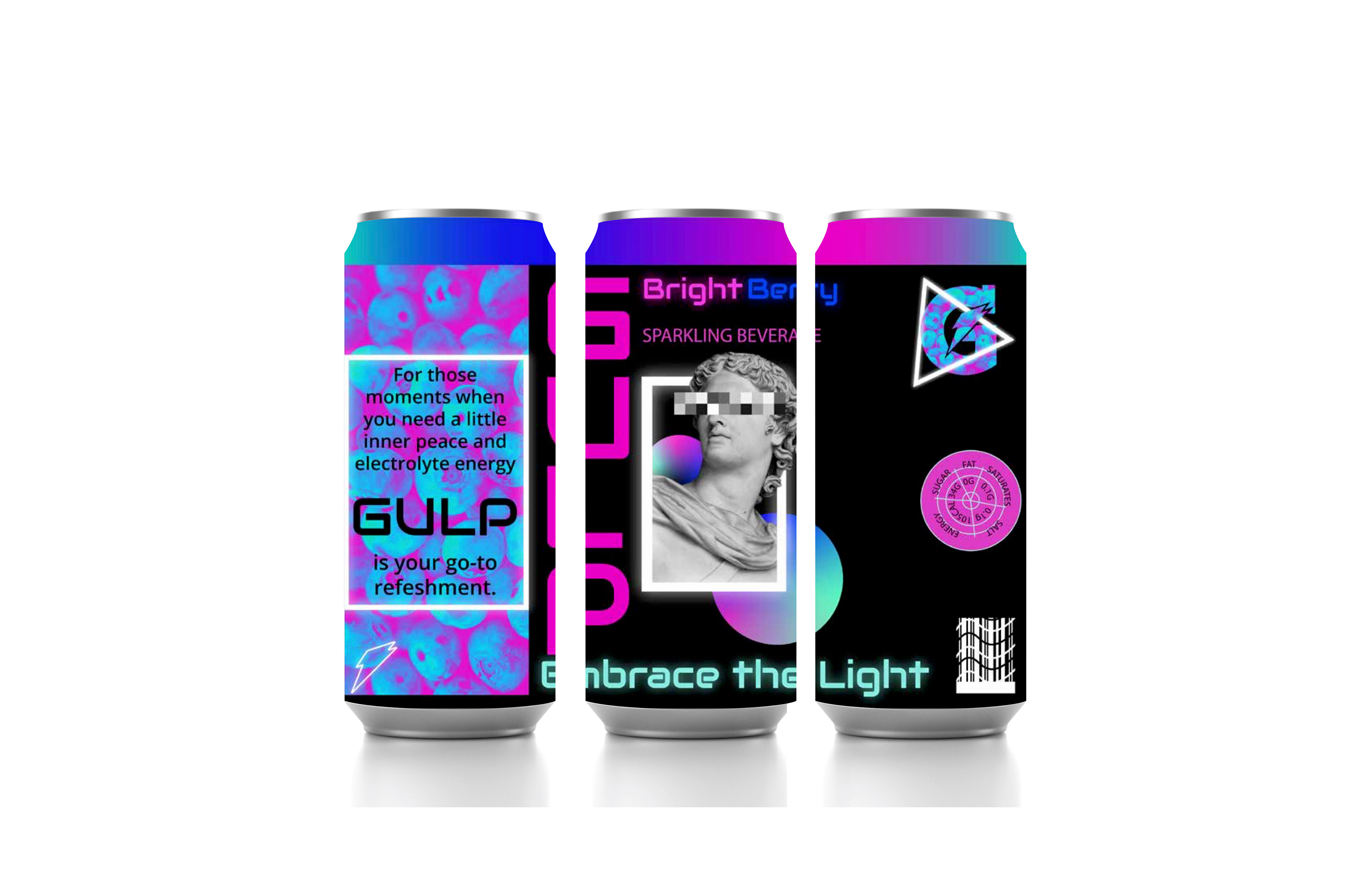
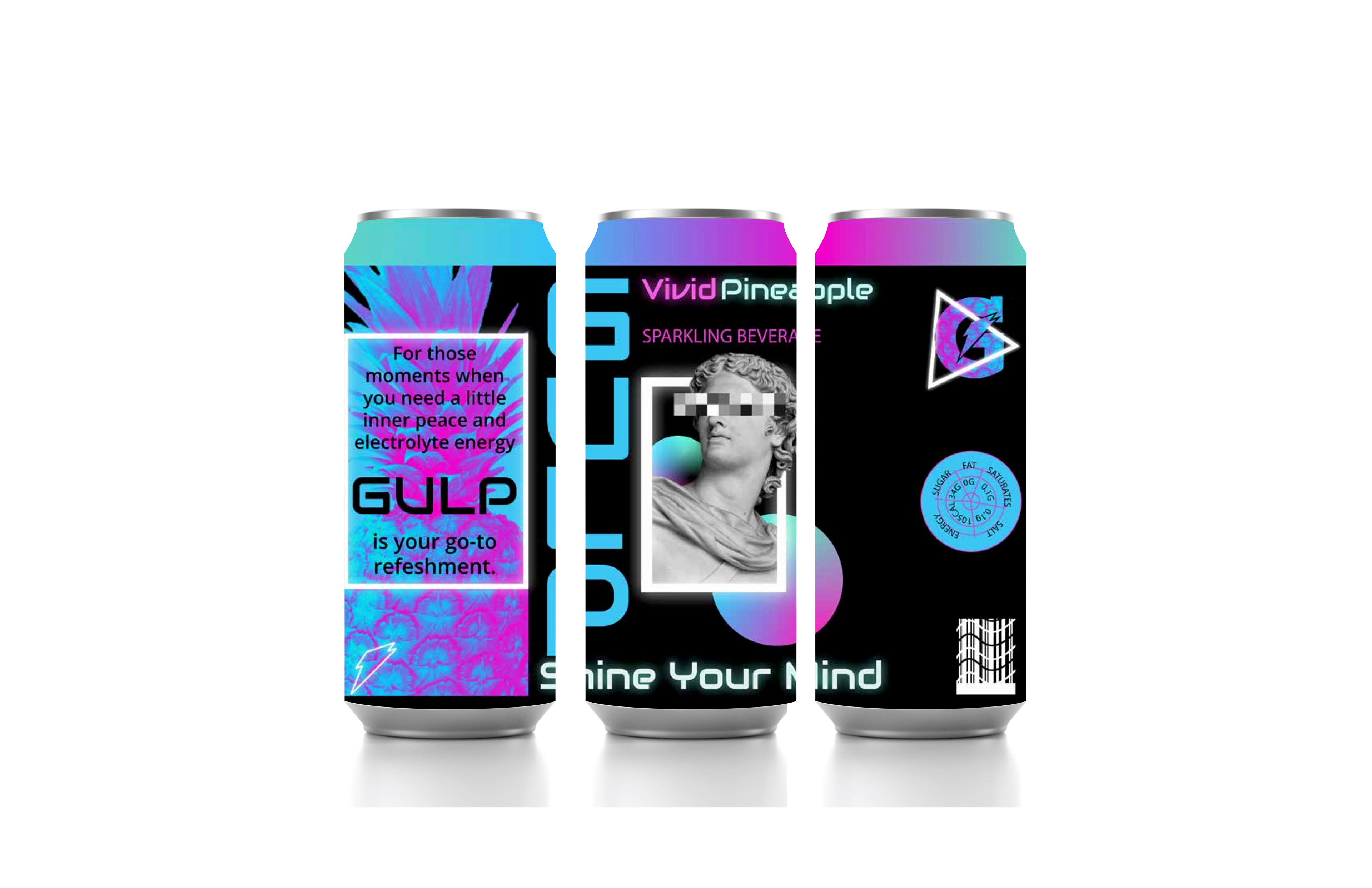
16oz/473ml Soda Can
I chose the 16oz can as my packaging because it is similar to other energy drinks on the market and I also thought the large size would enable me to increase the amount of detail in my design.
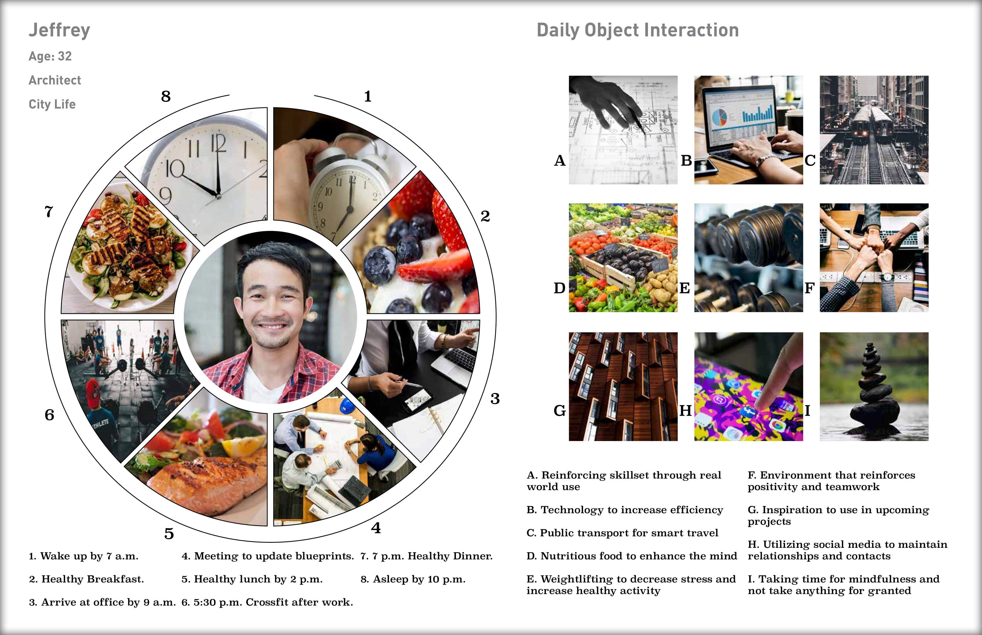
I created a customer profile using the target market image.
This document includes psychographic, demographic, and geographic characteristics, as well as dislikes, interests, buying patterns, and social media preferences of the target customer.
Part 2: Concept Board
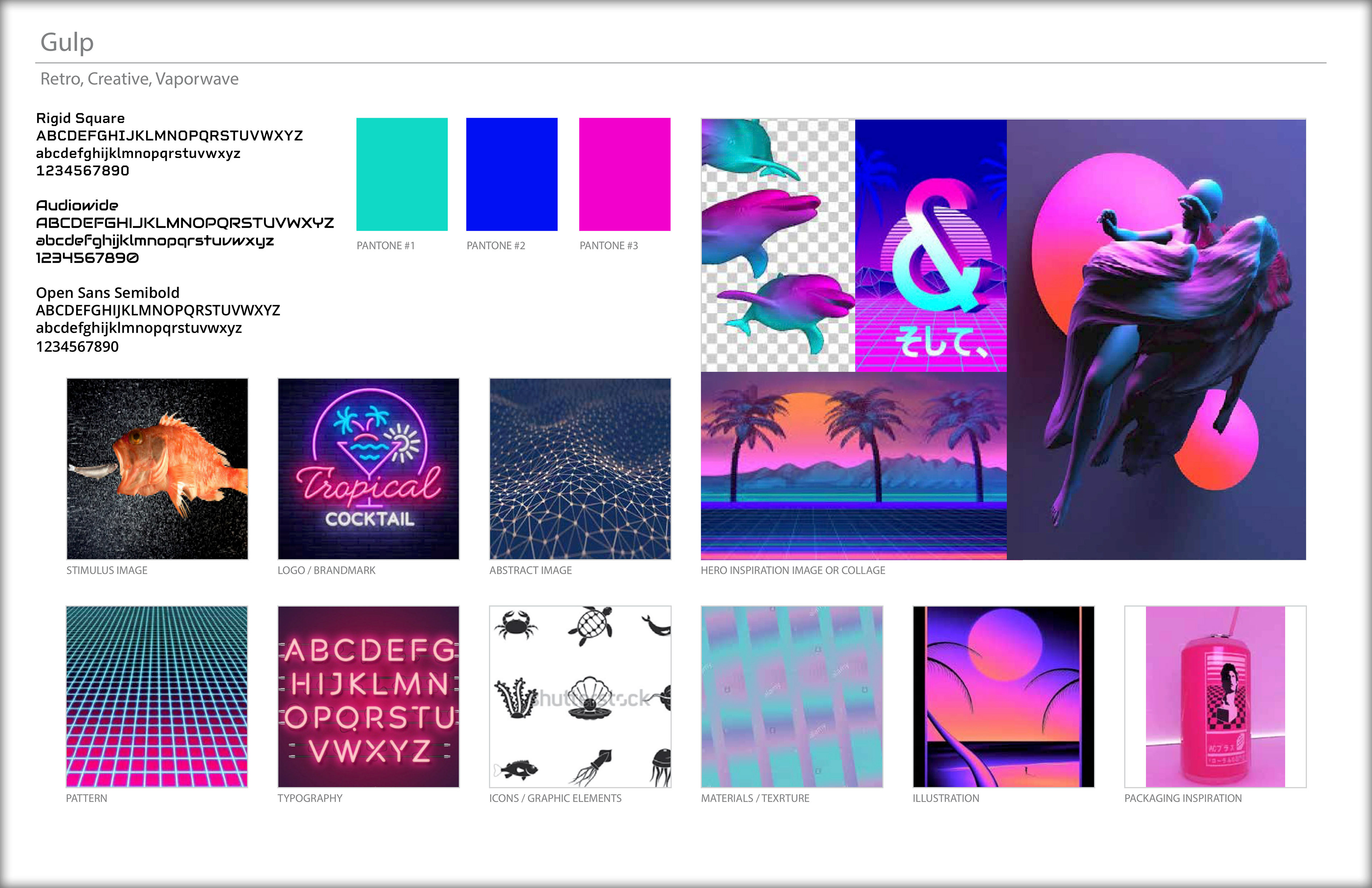
This concept board illustrates product attributes, inspiration, themes, and color and font ideas.
I decided to incorporate a vaporware-inspired design, based on the exciting color schemes that promote energy and excitement that would appeal to a younger demographic.
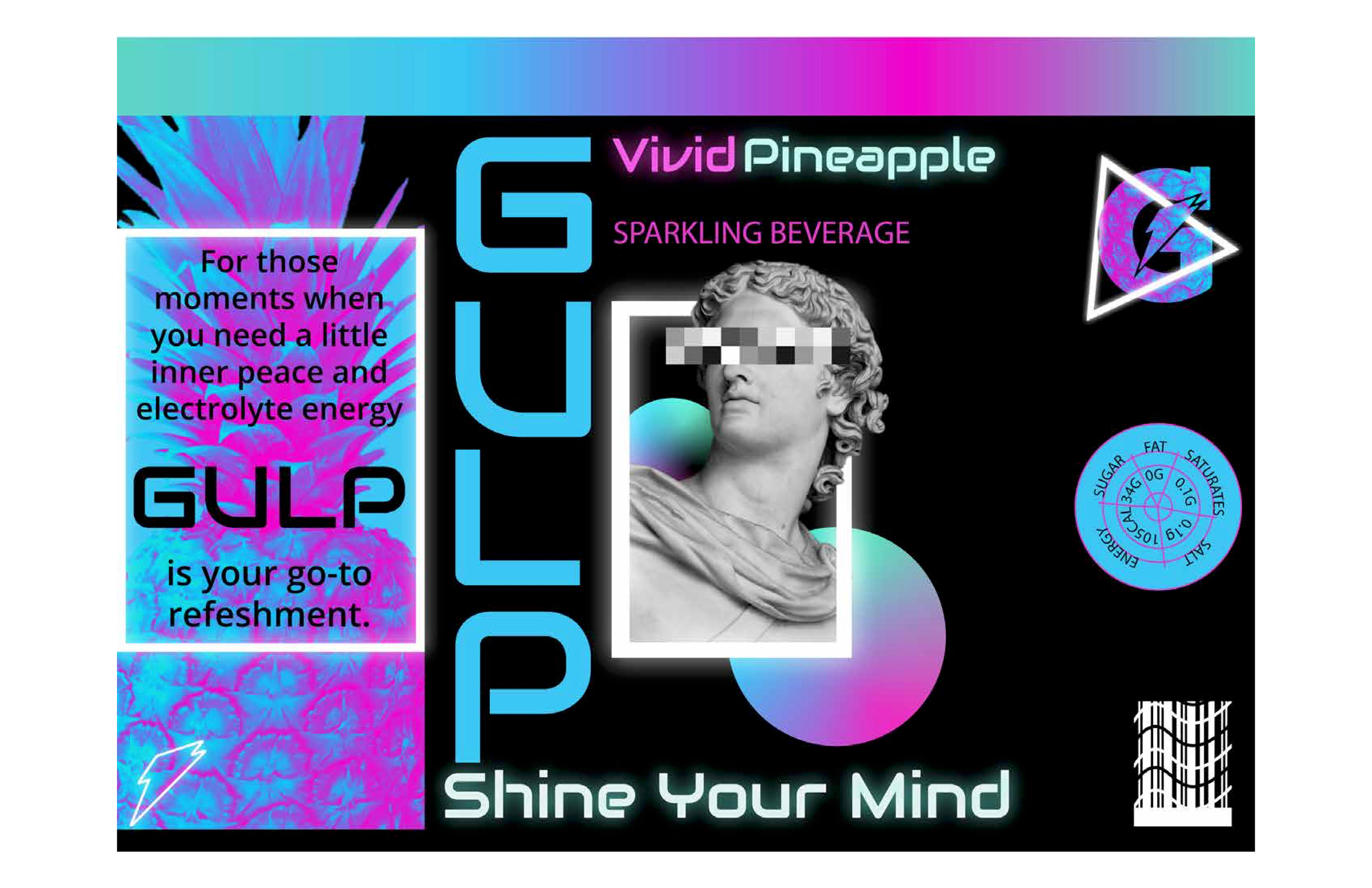
Part 3: Visual Identity - Style Concepts
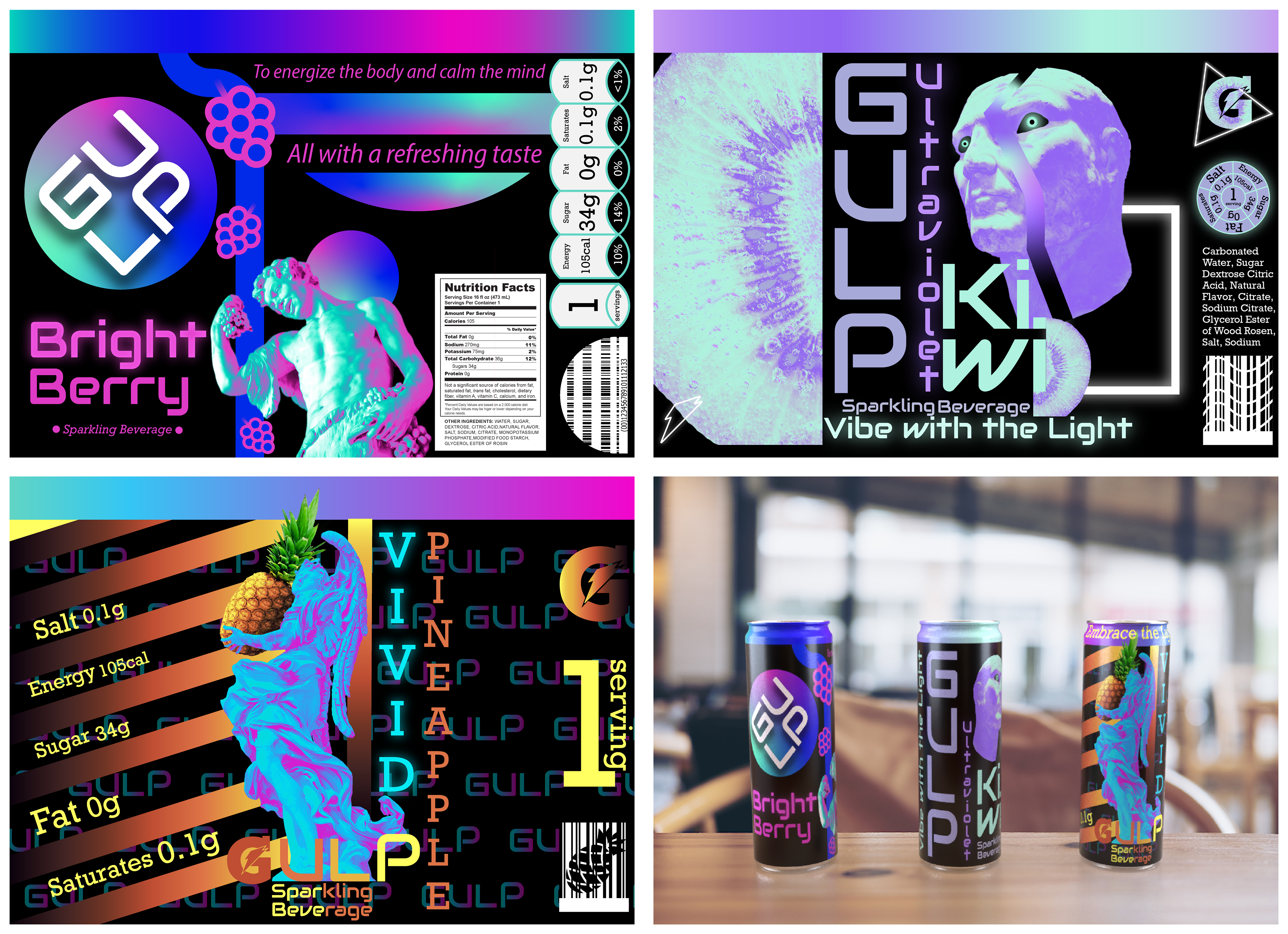
These are my first concepts: each style represents a separate drink flavor.
Of the three designs I created, this is the style I chose for the look of the brand going forward.
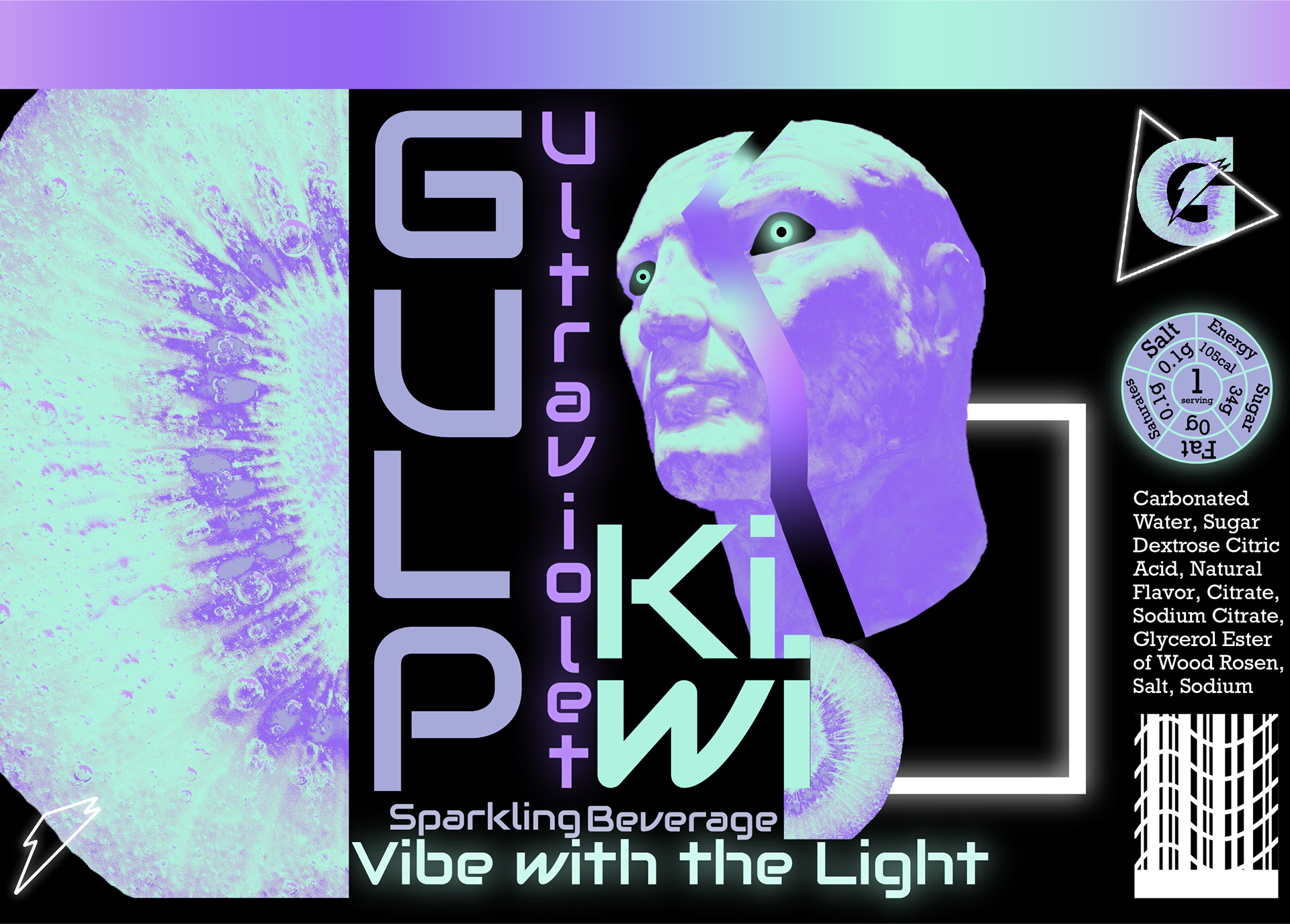
Part 4: Style Refinement
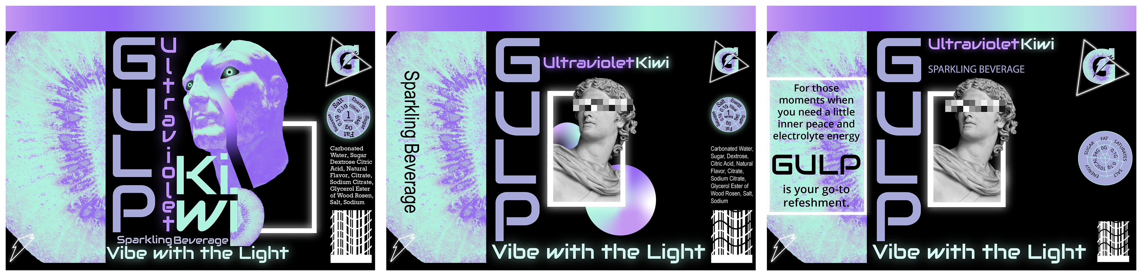
After choosing the style I liked best, I further refined the label until I decided upon a final design from which to base all the other drink flavors. (From Left to Right: original idea to final design)
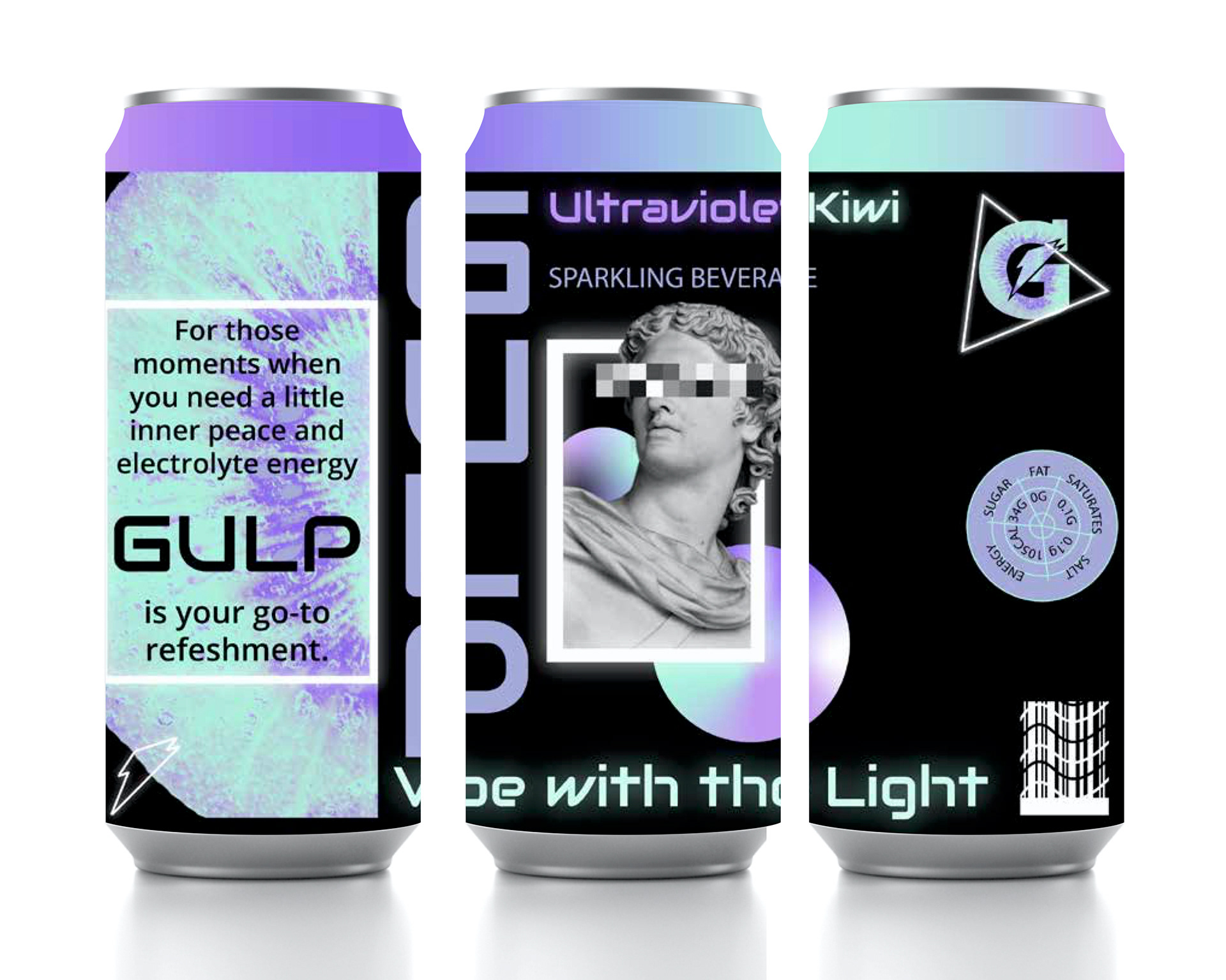
Part 5: Final Designs
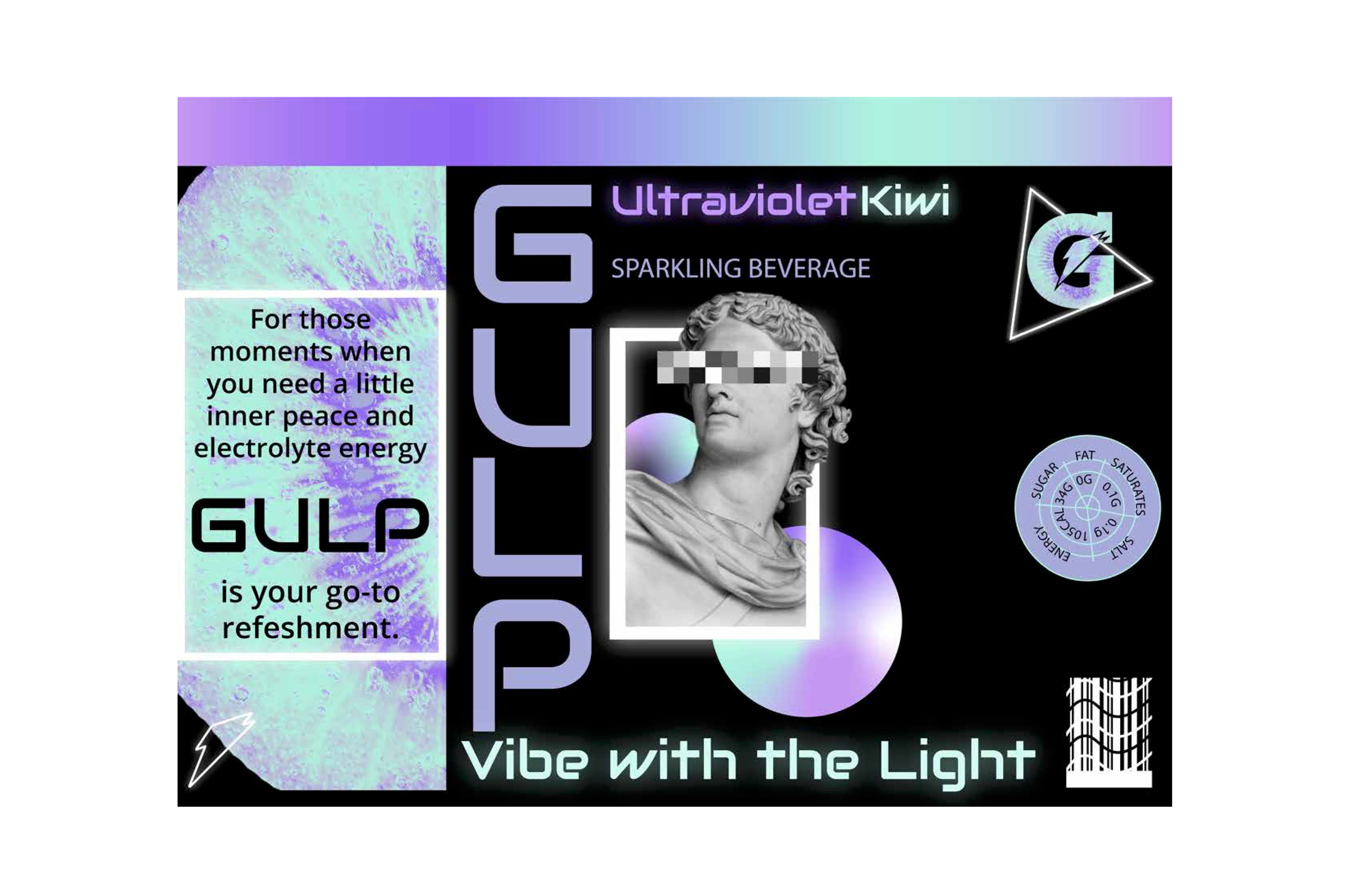
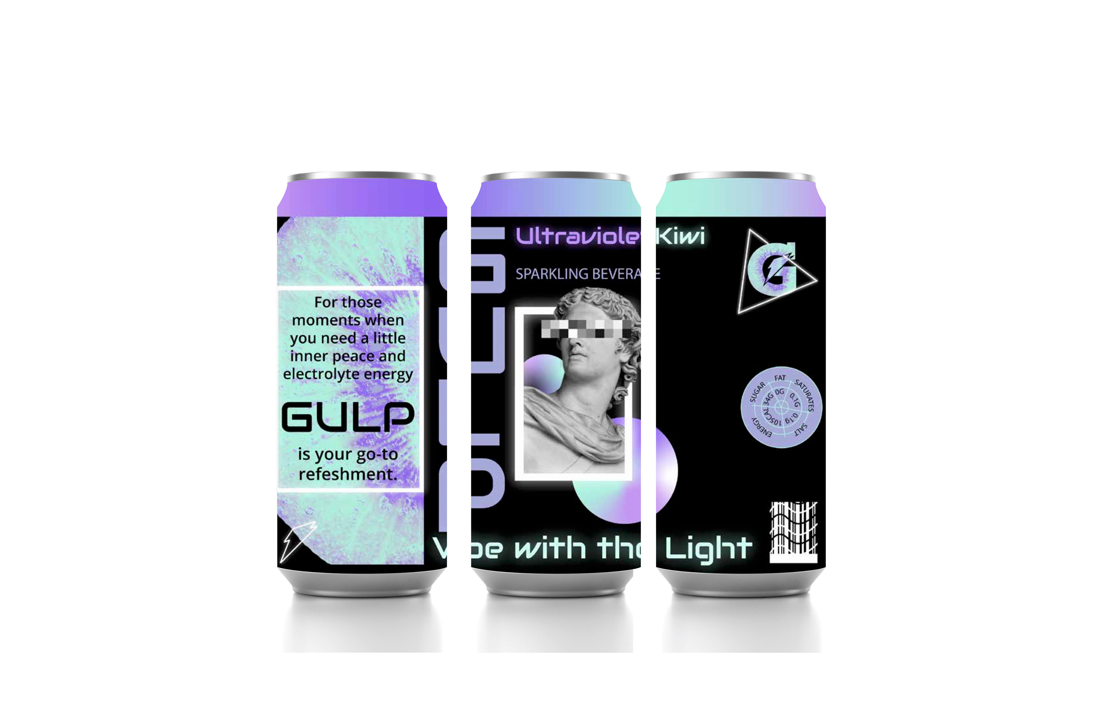
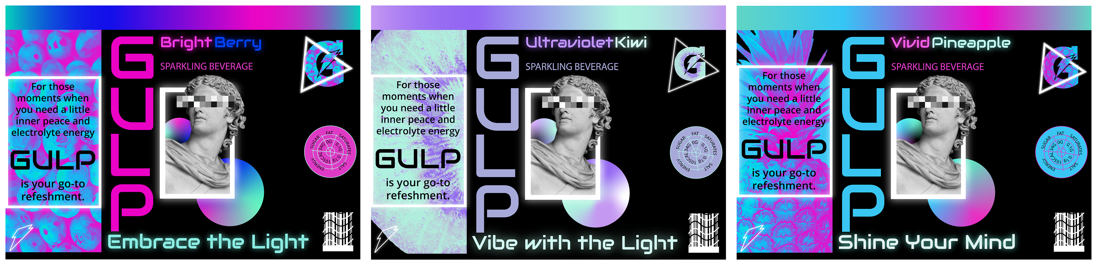
My three final designs, one for each flavor.